Metrics: Golden Signals, RED, and USE
Metrics monitoring for a distributed fleet: time series metrics (counters, gauges, histograms) the four golden signals, RED vs USE and when each applies, and the budget-based alerting that keeps pages honest.

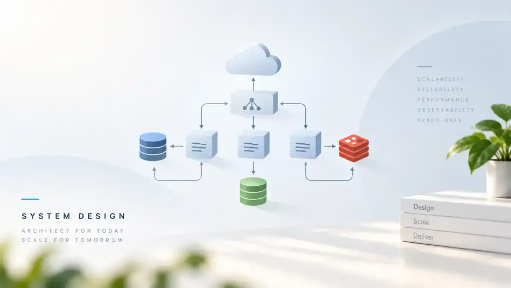
Metrics monitoring is the practice of watching a system through numbers aggregated over time (counters, gauges. Distributions collected on a fixed interval) so that a fleet’s health, load. Failure trends can be stored cheaply, queried fast, and alerted on without reading the underlying events.
What metrics monitoring is
A metric is one named number, tracked over time: http_requests_total, queue_depth, replica_lag_seconds, each sample timestamped and each series identified by a small set of labels. Collect them on a fixed interval (scraped from the service or pushed to the collector, both patterns are standard) and a fleet’s life becomes a set of curves: demand rising at noon, latency climbing after a deploy, a queue filling as a consumer falls behind. That is metrics monitoring: watching those curves, on dashboards and through alerts, instead of watching events one at a time.
As a result, what aggregation buys is the pillar’s whole economy. Storing one number per interval per label-set costs almost nothing (years of history fit on modest hardware) and querying it is fast enough to power dashboards that refresh while you watch. A fleet of a thousand instances becomes a handful of curves that one engineer can scan in a minute. No other pillar scales like that: the log keeps every event and pays for the privilege; the metric keeps the summary and banks the difference.
How this plays out in practice
What aggregation costs is the individual. A metric that says “error rate 2.3%” cannot say which user, which request, or which message; the detail was averaged away at write time. The blind spot is structural: metrics are “blind to whatever was not counted,” so the discipline has a rule to match. Decide what to count before it matters; name the metric, define its labels, write down what it means; and when the trend says something is wrong, hand off to the pillars that can name names: the log for the record, the trace for the journey.
The metric rings the bell; it does not investigate the fire.
In contrast, treat the metric inventory as a contract, because everything downstream keys on it. A named metric with stable labels is an API: dashboards consume it, alerts consume it, canary ramps abort on it. Renaming it breaks all of that at once. The contract is also where the cardinality budget is enforced; a series exists per label combination, so labels are chosen few and bounded. The unbounded dimensions (user, request, order) are never metrics labels; they belong in the record and the trace.
Time series metrics: counters, gauges, and histograms
Time series metrics arrive in three data types, and each answers a different question about the same number. The counter only ever goes up (requests served, bytes written, errors encountered) and it is never read directly: what matters is its rate, the increase per interval, which is what “requests per second” actually is. A counter resets to zero when the process restarts, and any competent rate calculation handles the reset; the failure mode is treating the raw total as the signal and panicking at every deploy.
The gauge is a value that goes up and down: current queue depth, memory in use, replica lag in seconds, open connections, the number of live instances. Gauges are read as they are: “how full is it right now?” is a gauge question, and most of saturation monitoring is gauges with budgets attached. The counter tells you what happened over time; the gauge tells you the state you are standing in.
As a result, the histogram exists because averages lie. It records observations into pre-chosen buckets (“how many requests took under 10ms, under 50ms, under 100ms”) and computes quantiles from the bucket counts. latency can be read as percentiles: the median, and the tail where the suffering lives. The cost of the histogram is the bucket boundaries, chosen at design time: too coarse and the p99 flattens into the same bucket as everyone else; too fine and every boundary becomes its own series. The general rule is stated once and honored forever, never report latency as a single average.
Trade-offs worth weighing
The average of a healthy fleet and a dying one can be the same number.
What holds the three types together is the time series database at the storage tier: series indexed by name and labels, samples appended per interval, queries that slice by label and window without touching raw events. The cardinality budget is enforced here or nowhere; every additional label multiplies the series count. A label like user_id turns one series into a million. The boundary is the same one the series hub drew: metrics bound cardinality to stay cheap, and the unbounded dimensions live in logs and traces instead.
In contrast, the last piece of the data model is time itself. A sample without a timestamp is a rumor, and alignment matters: a scrape interval of fifteen seconds cannot answer a question about a five-second spike. A retention of a day cannot answer a question about last month’s capacity planning. Interval and retention are design decisions with the same status as bucket boundaries: chosen at design time, defended at review, and revisited only with a reason.
The four golden signals
The four golden signals (latency, traffic, errors, saturation) are the standard minimum set for watching any service. Each exists because its absence has a specific price. Latency: the time to serve a request, read as percentiles and split by outcome; the successful request’s time and the failing request’s time are different numbers, and mixing them is how a fleet that is failing fast looks “fast.” Traffic: the demand itself; requests per second, bytes per second, messages per second, jobs per second. Every other number is meaningless without the load it was measured under.
Errors: explicit failures (the 500s, the exceptions) plus the implicit kind the counters miss by default: wrong content served as a success, a policy quietly declined, a fallback answering with stale data. Saturation: how full the constraining resource is: CPU, memory, disk, connection pools, queue depth; the signal that predicts trouble before it happens, because saturation is where latency is about to come from.
Failure cases to expect
As a result, the signals earn “golden” by composing. A latency problem with flat traffic is a system problem; the same latency with doubled traffic is a capacity question. Errors that rise while saturation rises point at a full resource; errors that rise while everything else is calm point at a bad deploy. The fleet has already been writing these curves all along: a circuit breaker’s open-transition count is an error signal with a story attached; a service registry’s churn is saturation of trust; replica lag is saturation that has started charging interest.
The four signals are not new numbers to invent; they are the existing numbers, named and watched together.
Golden signals vs RED vs USE
Two named methods cover the same ground from different altitudes, and the honest comparison is a mapping, not a rivalry. RED (Rate, Errors, Duration) is the request method: it watches a user-facing service through the requests it serves. It is three of the four golden signals re-cut for services (traffic→rate, errors, latency→duration). USE (Utilization, Saturation, Errors) is the resource method: it watches a component through the resources it consumes. It is the saturation half of the golden signals given a whole method of its own.
Utilization asks how busy the resource is; saturation asks how much is queued behind it; a distinction that matters. A disk at 100% utilization is full while a CPU at 100% utilization has merely started queueing.
Design details that matter
The layering rule that settles “which to use” is neither-nor: USE belongs on every resource (every node, every disk, every pool, every broker). Infrastructure fails from the bottom up; RED or the full golden set belongs on every user-facing service, because customers experience from the top down. A mature fleet runs both layers and lets incidents triangulate between them: the service layer says “checkout latency is at the tail,” the resource layer says “the payment pool is saturated,” and the alert that names both is the diagnosis most of the way written.
Choosing one method fleet-wide is how teams end up either watching graphs they cannot act on (resource numbers with no service context) or alerting on symptoms they cannot explain (service numbers with no cause visible).
Alerting on metrics: budgets and burn
The alert is this pillar’s exclusive product, and it deserves the discipline of an exclusive. The hub’s rule is the first one: alerts fire on symptoms, not causes. A symptom is a customer-experienced degradation (error rate over budget, tail latency over budget, availability under target) and it justifies a page. A cause is an internal state (CPU at a number, a queue at a depth) and it belongs on a dashboard, where it explains the symptom after the page fires.
The test for any proposed alert is the on-call engineer’s first question: “what do I do when this fires?” If the answer requires a cause hunt, the alert fired too early or on the wrong number.
Budgets are what make thresholds meaningful. The SLA/SLO/SLI vocabulary supplies the frame: an error budget is the errors a service may spend per window while keeping its promise. Alerting on budget burn (how fast the budget is being consumed, checked over two windows so a fast burn pages quickly and a slow burn still gets noticed) turns raw rates into decisions.
Operational realities
The fleet has been using the budget style all along: replication-lag monitoring alerts “when any replica’s lag crosses the class’s budget, not some generic threshold,” which is precisely the pattern: a declared tolerance per class of work, an alert that names the violated class.
Every cause metric still earns its keep, on a dashboard. The numbers that diagnose are the same numbers that page too easily: rebalance frequency watched “as a first-class metric,” Sentinel’s monitoring of a primary’s liveness, a bounded queue’s fill level, the breaker state that is “worth a metric” on every transition. Dashboarded, they are the first panels an engineer opens; converted carelessly into alerts, they are the pages that train a rotation to sleep through them. The routing decision (symptom to the pager, cause to the board) is the whole of alert design.
The discipline closes with the canary, because the ramp is where metrics make shipping decisions. Its abort criteria are “written against” golden signals and time series. The ramp trusts the numbers only as far as the alerting discipline deserves: a fleet whose thresholds are noise will abort good releases and ship bad ones. A fleet that budgets first ramps on evidence. The same curves, the same budgets, the same burn rates, serving the deploy pipeline instead of the pager. Metrics monitoring is one discipline with many consumers, and the budget is what all of them read.
FAQ
Why are they called golden signals? The four (latency, traffic, errors, saturation) come from the site reliability engineering practice popularized by Google’s SRE teams. “golden” is the claim that they are the minimum set worth watching on any service: cover these four and most system trouble becomes visible, skip one and a whole class of incidents goes unnoticed. They are not a framework to adopt so much as a checklist to keep: four numbers, named, watched together.
RED or USE, which should we pick? Both, layered. USE on every resource (the nodes, disks, pools, and brokers) because infrastructure fails from the bottom up. RED (or the full golden set) on every user-facing service, because customers experience from the top down. Picking one fleet-wide is the common mistake: resource-only fleets watch graphs they cannot act on, service-only fleets alert on symptoms they cannot explain.
How many metrics should a service expose? A bounded, named inventory: dozens of well-defined series, not thousands. Every label combination is its own series, so the cardinality budget is the real limit: a metric with a user label is a million metrics. The test is whether each series has an owner, a meaning, and a consumer; a series nobody reads is storage spent on superstition. A series nobody can explain is worse, because it will one day be the one that spikes.
What can metrics not tell us? The individual. An error rate cannot say which request failed or why; a latency percentile cannot say which hop the request waited on. That is not a defect but the trade that makes metrics cheap. The handoff is built into the series: the metric rings the bell, the log names the event, the trace reconstructs the journey. A fleet that tries to make metrics answer all three questions pays log-scale bills for metric-scale answers.
Related articles
- Next read: distributed tracing, series part 4 and the series finale: spans, context propagation, OpenTelemetry, and sampling; the pillar that reconstructs what this one only counts.
- monitoring and observability, the hub of this series: the vocabulary, the pipeline, and the comparison table that says which pillar answers which question.
- logging: series part 2: the record that turns this pillar’s bells into diagnoses, one structured event at a time.
- blue-green vs canary deployment, the canary’s evidence: the ramp and its abort criteria, written against golden signals and time series.
- circuit breaker pattern, the fleet’s own error signal with a story attached: every state transition is worth a metric.
- read write separation, replication-lag budgets in action: the budget-alerting style this article generalizes.
- service discovery, the registry as infrastructure with its own golden signals: churn, eviction rate, and stale hits.
- availability vs reliability vs durability, the SLA/SLO/SLI vocabulary behind the budgets this pillar alerts on.
Share this:

Related articles
HTTP/2 vs HTTP/3: Multiplexing, QUIC, and Real-World Performance
HTTP/2 vs HTTP/3 compares streams, head-of-line blocking, and QUIC so you can pick a protocol that stays fast…
Microservice System Design
Executive Summary: Splitting a monolith into services without design discipline trades one problem for distributed complexity. I cover…
Semantic Versioning in Practice: Breaking Changes, Deprecation, and Trust
Semantic Versioning in Practice shows how you mark breaking changes, deprecate old APIs, and keep the trust of…
RED for the API layer and USE for the nodes is how we split dashboards too, but we still over-alert on saturation sometimes.